Designing an effective product label is key to ensuring that you will have a product that is able to catch the consumer's eye and also tell them what you have. Some brand-owners assume that in order for a product label to be effective, it has to be unlike anything that the customer has seen before - with a wealth of information and a label design unusual enough to make Pablo Picasso proud.
Well, we're here to tell you that having a complicated product label design is not always necessary, nor productive from a sales perspective. Designing an effective, concise, and eye-catching label isn't always about how many components you can cram into a certain amount of space. More often than not it's about how well the elements work together to communicate the desired product and brand message to your potential customers. In an effort to help you avoid designing and printing a cluttered, busy, and overly-complicated label, we have a few tips for you and questions to ask yourself during the design process itself.
Label Design Doesn't Need To Be Complicated
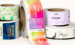
One of the most difficult aspects of designing a label is understanding when enough is enough. One piece of advice that we offer to many of our customers is, "Just because you can add a certain design element to your label, doesn't always mean that you have to (or that you should)." Some of the most effective custom product labels are clean, concise, and to the point. It may initially be tempting to fit as much pizzazz and information as possible on your custom labels (i.e. product facts, benefits, brand story, social icons, QR codes, etc...), but it may not always be the best decision - indeed, we respectfully suggest that "less is more" in most cases.
For example, while a shiny metallic label in an unusual shape might potentially look really cool on your product packaging, it doesn't necessarily mean that... 1) it will actually adhere to the container properly, 2) that it will stay on the package for the life of the product, or 3) that it will allow for proper presentation of the brand imaging or product information. A balanced and elegant product label design can be just as effective (if not more so), than a label that tries to do too much.
Make Sure The Product Label Flows With the Packaging
While it is okay to design a uniquely shaped label for your product, you need to make sure that the label shape will flow with the shape of the packaging. Never guess at the size or shape of a product label – having labels designed and printed without proper testing can be an expensive mistake. Similarly, never buy containers without seeing a physical sample first. Some customers have learned the hard way that what they saw in a photo online was no replacement for holding one and making sure it worked the way they expected. Yes, it can take time – but rushing any project this important is a recipe for disaster. Once you have your sample packaging in hand, this brings us to our final recommendation.
Try Out A Couple Of Different Designs By Printing Test Labels
Sometimes we have customers who want to test a couple of different product label designs before making the final decision on which design to print for their products. Trying to visualize how a label design will look after it has been printed is never as simple as looking at the design on a computer screen and assuming that the printed result will look identical - indeed, colors often vary significantly between computer monitors and printers of all kinds. This is why we always recommend printing out a full-size test label on your desktop printer (which will at least allow you to test the size and application), even if the colors are unlikely to be exactly be the same as our presses will print - due to differences in technology between printing platforms. If color is critical, or if you want to see a variety of designs before committing to one, we offer press-printed Concept Proofs so that you can compare different approaches and apply them to your containers for a real test. Click here to learn more about Printed Concept Proofs.
It can be very tempting to cram as much information on your product label as possible. Just remember to periodically check your product label design as you add new elements or reposition existing ones. A product label design that looks great on a computer screen at four times the actual size, may look cluttered and hard to read at its actual printed size. We often encounter label artwork that simply doesn't work when printed to scale - another compelling reason to test-print everything yourself before assuming anything.
In short, always take the time to think through each design aspect of your product label. It's important to understand when enough is enough, and when excess imaging or information on a label becomes a liability versus a benefit. A product (or its label) does not need to be unique in order to be competitive. Often times, designing a clean and simple label design that presents the product in a way that doesn't need a lot of time to understand can be the most effective path to take.
