Your product label is more than just a way to convey information—it's a critical component of your brand’s identity. The font you choose for your label can speak volumes about your product before a customer even reads a single word. But with so many options available, how do you decide which font is the best for your label?
This guide will help you navigate the world of fonts, giving you the insights needed to make the right choice for your product. From classic favorites to modern must-haves, we’ll cover everything you need to know about selecting the perfect typeface for your labels.
How to Choose the Best Fonts for Your Product Labels
The Role of Fonts in Label Design
Fonts aren’t just about aesthetics; they’re about functionality and branding. The font you choose will impact how your product is perceived, and whether the information on your label is easily understood. But what makes a font suitable for labels?
First and foremost, readability is key. Your label might contain essential information like the product name, ingredients, or usage instructions, so the font must be clear, even at small sizes. Fonts with clean lines and well-defined shapes are often the best choice.
Beyond readability, think about how your font aligns with your brand identity. Is your brand modern and minimalist, or does it have a more traditional, luxurious vibe? The font should reflect these qualities and create a consistent visual language that resonates with your audience.
Then there’s the emotional impact of a font. Believe it or not, fonts can evoke specific emotions. A heavy, bold font might convey strength and reliability, while a delicate script font could suggest elegance and sophistication. Understanding these subtle cues can help you choose a font that not only looks good but also feels right.
Popular Fonts for Product Labels
Choosing the right font can seem daunting, but certain fonts have stood the test of time and are known for their effectiveness in label design. Here are a few popular options that you might consider for your product labels:
Helvetica:

This sans-serif classic is loved by designers for its clean lines and modern aesthetic. Helvetica is versatile and works well in various sizes, making it an ideal choice for both brand names and ingredient lists. Its neutrality allows it to blend seamlessly with almost any design style, whether your brand is minimalist or bold.
Garamond:
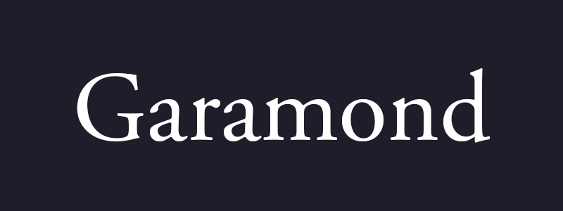
For brands that want to evoke tradition and elegance, Garamond is a go-to serif font. Its refined design adds a touch of sophistication, making it a favorite for luxury products like fine wines, gourmet foods, and high-end cosmetics. Garamond’s timeless appeal can help your product stand out as a premium offering.
Futura:

If your brand is all about innovation and modernity, Futura might be the perfect fit. This geometric sans-serif font is sleek and forward-thinking, making it ideal for tech products, artisanal goods, and eco-friendly packaging. Futura’s clean, simple lines convey a sense of precision and clarity, which can be particularly appealing in today’s market.
Arial:

Arial’s clarity and readability have made it one of the most widely used fonts in the world. This sans-serif font is straightforward and highly legible, even in small sizes. It’s a safe choice for labels that need to communicate information clearly and effectively without overshadowing the product’s design.
Times New Roman:
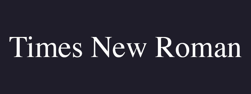
Associated with tradition and professionalism, Times New Roman is a serif font that brings a sense of heritage to your labels. It’s an excellent choice for brands that want to evoke reliability and trust. Times New Roman works well in formal settings and can add a classic touch to your product’s appearance.
Open Sans:

Looking for something that feels friendly and approachable? Open Sans, a humanist sans-serif font, offers excellent readability and a warm appearance. It’s often used for detailed text on labels, such as product descriptions and ingredients, because it remains legible at smaller sizes.
How to Choose the Right Font for Your Labels
Selecting the perfect font for your labels isn’t just about picking one that looks good—it’s about ensuring the font aligns with your brand and the message you want to convey.
Start by thinking about your brand’s voice. Is your product playful, luxurious, bold, or subtle? The font should match this tone. For instance, a quirky, handwritten font might be perfect for a children’s product, while a sleek, modern font would suit a high-tech gadget.

It’s also important to consider readability. Even the most beautiful font is ineffective if it’s hard to read. Test your font at various sizes and on different backgrounds to ensure it remains clear and legible. This is especially crucial for labels that will be viewed from a distance or in low light.
Lastly, think about how many fonts you’ll use on your label. While it might be tempting to mix and match, it’s best to limit yourself to two or three fonts at most. A primary font for your brand or product name, and a secondary font for additional information, should suffice. Too many fonts can make your label look cluttered and confusing.
Example: Consider a new line of organic skincare products. For a “Lavender Calm” scent, Garamond could enhance the luxurious feel of the product, while Open Sans might be better suited for the ingredients list, ensuring it remains readable and clean.
Creative Font Pairings for Labels
Pairing fonts effectively can elevate your label design, creating a cohesive and visually appealing package. Here are some classic font pairings that work well together:
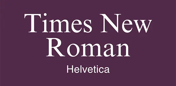
Helvetica and Times New Roman offer a blend of modern simplicity and classic elegance. This combination is versatile and can be used across various product categories, from gourmet foods to tech gadgets.
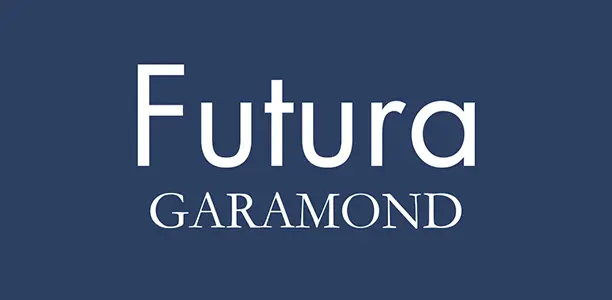
For a more contemporary feel, consider pairing Futura with Garamond. Futura’s geometric design compliments Garamond’s traditional serif style, balancing modernity with heritage.
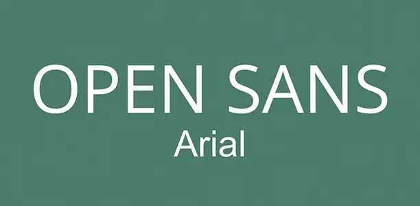
If clarity is your priority, Open Sans and Arial make a great pair. Both fonts are highly readable and work well in different sizes, making them ideal for labels that need to convey a lot of information without overwhelming the design.
Pro Tip: When pairing fonts, aim for contrast. A bold sans-serif font paired with a delicate serif font can create visual interest while maintaining readability. Tools like Font Pair can help you experiment with different combinations to find the perfect match for your labels.
Label Font FAQs
What’s the best font for small print on labels?
For small print, readability is paramount. Helvetica and Open Sans are excellent choices due to their clarity and legibility, even at smaller sizes. They work well for ingredient lists, instructions, or any detailed text that needs to be easily read.
Can I mix fonts on a label?
Absolutely, but with caution. It’s important to choose fonts that complement each other rather than clash. Typically, a more decorative font is used for the brand name, while a simpler, more readable font handles the supporting text.
Are there dyslexic-friendly fonts for labels?
Yes, sans-serif fonts like Arial, Verdana, and Open Sans are often recommended for their readability. These fonts feature distinct letter shapes that reduce confusion, making them more accessible for people with dyslexia.
How many fonts should I use on a label?
It’s generally best to stick to two fonts. One for the brand or product name, and one for additional text. Using too many fonts can make the label look busy and decrease its readability.
Should I use serif or sans-serif fonts on my labels?
Both have their benefits. Serif fonts like Garamond are great for luxury or traditional products, while sans-serif fonts like Helvetica provide a modern, clean look. The choice depends on your brand’s identity and the message you want to convey.
