


Digital Label Printing And The Building Blocks Of Color
Let’s try to decipher one of the most misunderstood facets of printing, RGB vs. CMYK – something we encounter on a daily basis (so don’t feel too bad if you have no clue what we’re talking about – yet).
RGB stands for Red/Green/Blue. Computer monitors make up the colors you see on your screen by using a mixture of these three basic colors. Well, they’re not actually “mixed” at all, but the monitor arranges tiny dots (called pixels) of the primary colors in patterns that make it appear to the eye that it’s a different color completely. The physical arrangement of the red and blue dots (pixels) fools the brain into thinking that it’s a flat purple color, when it’s actually not.
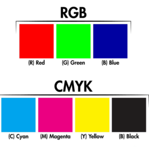
Now we move to CMYK, which is an abbreviation of Cyan/Magenta/Yellow/Black (the “K” actually stands for “Key”, but it effectively represents Black to the layman). Long ago, printing devices were standardized to use these 4 primary colors to achieve a combination of dots to represent many other colors – which is why your desktop printer probably has 4 toner cartridges or inks. If you’re interested in seeing this phenomenon for yourself and you have access to a magnifying glass or similar, run something colorful through your printer (like a scenic photograph) and look closely at the output. You’ll see many individual dots of color arranged to create the impression of the colors you think you see.
Now you can begin to understand the challenges associated with making sure the artwork files you submit to a print-shop have been created using the CMYK method of color-creation rather than the RGB mode that your computer monitor uses. Files created in RGB mode will be automatically converted to CMYK when printed, and this conversion frequently changes the visual colors significantly. CMYK has a much narrower “color gamut” than RGB, so what you see on your screen may be impossible to accurately reproduce on a printer.
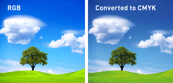
Sadly, even many professional designers forget to engage CMYK-mode when beginning a new design task for printing – which makes it very difficult to predict what the printed output will look like. It’s critical that you (or your designer) start out on the right foot (i.e. in CMYK mode), and it’s also important to remember that your computer screen is displaying colors using RGB anyway – so don’t expect the printed colors to be the same as what you see on your computer. This may sound completely counter-intuitive, but you need to understand that printers and computer screens are very different devices and use different ways to display a given color. To complicate it further, computer screens also vary quite significantly - so the same design on various computers may look quite different too. Isn’t this fun?
Here's a useful exercise to see the physical impact of this challenge: take the same design file and display on it several computers, then print it on a couple of different printers that you have to hand. It would be surprising if the images all looked identical - but if they do then maybe it's time for your annual eye exam.
So, what's the best approach to make sure you get what you want? Well, there's no perfect or easy answer to this, because even different print devices don't always create the same colors - in other words you could get quite different results on 2 different printers in your own office, and neither of them may look anything like what you see on your screen. The only reasonably accurate way to predict what a given printer will produce when considering digital printing colors, is to test it and then adjust colors in your design software until you achieve the desired result. Sadly, even that may not match what a commercial printing press will produce, but its a good start. Then you could ask your print shop to produce a "press proof" printed on the same press they'll be using for the production run, and you should be reasonably confident of what you'll ultimately get.
Understanding Your Custom Label Printing Budget
Note - not all print shops can (or will) produce press proofs, and they may come at a cost anyway, so keep in mind that it only becomes useful if you're absolutely committed to a given color mix. For example, there's a very well-known large company with a distinctive red color on their soda cans, and they will (and should) insist on absolute color-matching, but most small companies can't justify the expense involved in achieving that same level of repeatability. Work within your budget with a good print provider and accept that what you see on your screen may not be precisely what gets printed.