

Published on 11/11/19 in happi Magazine, the leading media outlet in the personal care and household products markets. Original article here.
Product marketers call it the “first moment of truth.” A shopper that’s ready-to-buy has entered a store, and is laser-focused on a particular product category. The “moment” takes place as their eyes peruse a shelf full of products. Which item will they pick up and examine further? The answer can be found in the consumer’s subconscious, and the role that packaging plays is of paramount importance in this hypothetical situation.
Here are some statistics that should grab your attention (which is what you want your packaging to do!):
• 70% of purchasing decisions are made in-store
• 10% of shoppers will switch brands in-store
• 20% of shoppers will buy impulsively in categories they had no intention of purchasing in-store
In the competitive personal care products market, the look and feel of an item in a shopper’s hands can make or break a sale. Labels and packaging play a pivotal role in determining whether or not a shopper chooses a certain brand. In my experience, I’ve found that many personal care product brand owners treat product labeling as an afterthought. If they were reminded of the aforementioned figures on buying tendencies, I imagine they may give pause and reconsider their product’s label.
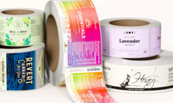
The way a product is packaged and labeled is often a customer’s introduction to a brand. It tells a story and conveys brand identity all at once. In fact, a well-designed personal care product label does a number of things:
• It informs the prospective customer about what your product is and how it benefits them. It makes no sense to have a label that simply says “Superior Skin Therapy” if it doesn’t also tell the reader WHY you’re making that claim. Tell them what your product does to justify the marketing jargon – otherwise they’re left wondering and may turn to a competitive product that explains itself better. That product may be inferior, but information wins the day.
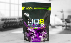
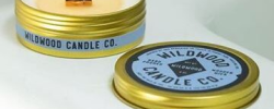
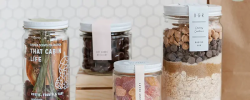
• It shows the prospective customer what your product looks like, hopefully in a flattering way. How you do this depends on the product itself – a beauty or personal care product could show the contents in normal use. Not all products lend themselves to a visual representation, but an image is always worth considering if it makes sense.
• It attracts attention away from competitive products. An eye-catching label will always fare better than a drab uninteresting one. Yes, this is a major part of the design task and everybody is fighting for the same space, but don’t get carried away with trying to be too radical or you may create a bigger (and more expensive) project than you expected when it comes to having your labels printed. One thing to keep in mind is that a professionally-designed label will usually just look better than something amateurish – after all, poor design is a visual distraction and only encourages viewers to focus on the wrong things.
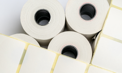
• Last but not least, a personal care product label design frequently needs to include a variety of regulatory information included to meet legal requirements. Safety warnings, ingredient listings, and even usage instructions are often a necessary part of the label design. This affects how much space you have to work with, and how readable the information needs to be – which feeds into font selection and layout considerations. These are once again specialist skills that many designers do not encounter in their normal work.
Designing and producing product labels isn’t rocket science. However, if you fail to follow some basic rules it can lead to a shopper putting a product back on the shelf to consider a competitor.
At Wizard Labels, when it comes to label design, we convey to our clients two important rules to follow that will ensure the best possible outcome:
Rule #1: Engage a competent designer who specializes in product label design
It’s not enough to be a graphic artist or website designer without also having the knowledge specific to product design, and labels in particular. For example, we see personal care product label designs that simply don’t fit the container and create major issues when the client begins applying the labels to the finished product. This may sound simple, but different container shapes and sizes can make the label designer’s task very challenging if they don’t begin with the end product in mind. Too many designers simply say “we need a 3” x 4” label” and begin the design – without testing whether that size and shape works in practice when applied to the product.
As silly as it may seem, beginning with a sheet of paper and a pair of scissors would save a LOT of mistakes we see – and those mistakes can be very expensive for you. Additionally, many designers we encounter don’t seem to understand the practical implications of using a particular software tool when their design gets printed. Using Photoshop to design labels with lots of small text is a very common error we see, and we’ve written about this in a blog post –see here.
When engaging a designer, always look for one who has extensive previous experience with personal care product labels (and a portfolio to prove it) – which is a small proportion of the design community. Which leads us to the next critical point – you get what you pay for!
The “connected world” we live in gives us ready access to skills all over the world – but choosing a label designer outside the country is most often based on financial considerations. That may sound attractive at first, but when you consider communication challenges, time-zone differences, responsiveness, and even simple things like measurements (metric versus imperial), a complex design project can quickly become a nightmare. We see them all the time in our business, and in most cases there’s nothing we can do to help a client who’s engaged an unseen designer with questionable skills just because they were cheap.
If you’re serious about your product, you need to be serious about the labels – and that means finding a competent designer with the unique skills that product labels involve. It also helps enormously if the designer is in your own time-space and is contactable by something other than email – a phone conversation is worth a hundred emails in our experience.
That said, high-quality local label designers do not come cheaply – it’s not unusual to see such professionals charging up to $100 an hour or more – but you can usually be confident that those rates are based on experience and competence, and it’s also important to understand that an hourly rate is no indication of value. A good designer might take 2-3 hours to produce a finished label design, whereas a less experienced designer might take many times as long (and bring a lot of heartache into the process as well). It’s no different than hiring an electrician or a plumber or an auto mechanic – buying cheap is a very short-sighted approach and almost invariably carries a higher cost in one way or another (financial or emotional).
Rule # 2: Consider label design early in the product development process
Do your research. You will need to understand your target customers — their age, gender, values, education, etc. — these vital pieces of information will inform your design decisions. You will also need to understand where the product will be sold. Presenting your product online can have different implications than when it is found on a physical store shelf, and we’ve written a blog post about this – see here.
Determine what packaging you will use. Here’s a critical tip that has helped many customers avoid expensive packaging/labeling mistakes. We recommend obtaining different packaging samples before designing your labels. Then, create a mock label. To “mock up” a rough product label design, you can simply draw and measure the intended shape on a piece of paper – then cut it out and try to apply it to the container. If it doesn’t lie flat against the surface or gets misshapen by the taper of the container (or has wrinkled edges), you know you have a problem. It may be possible to overcome the issue using smart product label design, but it’s critical to understand the challenges very early in the process.
While it is okay to design a uniquely shaped label for your product, you need to make sure that the label shape will flow with the shape of the packaging. Never guess at the size or shape of a product label – having labels designed and printed without proper testing can be an expensive mistake. Similarly, never buy containers without seeing a physical sample first. Some customers have learned the hard way that what they saw in a photo online was no replacement for holding one and making sure it worked the way they expected. Yes, it can take time – but rushing any project this important is a recipe for disaster. Once you have your sample packaging in hand, this brings us to our final recommendation.
Try a few different designs by printing test labels. Trying to visualize how a label design will look after it has been printed is never as simple as looking at the design on a computer screen and assuming that the printed result will look identical. Indeed, colors often vary significantly between computer monitors and printers of all kinds. This is why we always recommend printing out a full-size test label on your desktop printer, even if the colors aren’t exactly the same as what our professional digital presses will print – due to differences in technology between printing platforms. If you want to see a variety of designs before committing to one, we offer press-printed Concept Proofs so that you can compare different approaches and apply them to your containers for a real test.