
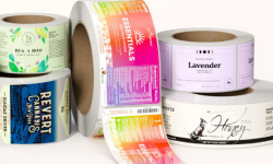


This post on product label design tips is authored by guest blogger Kimberly Head, CEO of Watergraphics, a leading branding and packaging design firm.
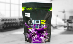
FILL THAT LABEL UP!
[why this is a bad idea]
WHITE SPACE CREATES IMPACT
You have a lot of information you want your buyer to know. Your story is amazing, you want people to know what is in your product, and you want the person to use your product correctly. The more detailed the directions, the better they will understand your product…right? And the best way is to relay all of this is to add as much information as you can on your label…right?
WRONG! Your mantra should be: the more white space, the more impact! What you need is MORE white space. The more white space your label has, the greater the impact.
White space is the portion of the label left unmarked, the empty space between elements. White space does not need to be white. It can be any color, texture, pattern, or even a background image.
White space isn’t merely "blank" space — it is an important element of design which enables the objects in it to exist at all; the balance between positive (or non-white) and the use of negative spaces is key to aesthetic composition.
A label crammed full of text or graphics with very little white space runs the risk of appearing busy or cluttered, and can be difficult to read. Good use of white space can give a label a classic, elegant, or rich appearance.
People get frustrated when information bombards them. We’re humans, not machines. White space calms us, letting us “breathe”.
In short, ample white space achieves three things:
• Improves legibility. Space between text and elements helps define the content and makes it easier to read.
• increases attention. White space is a powerful way to draw the users’ attention to a particular element. To surround the element with white space makes it stand out.
• Creates the right tone. The use of white space communicates elegance, openness and freshness.
Some Tips in creating white space:
Step 1: GATHER all information and graphics you want on your label, do not hold back – get it ALL.
Step 2: PLACE text and graphic elements on your label. At this time, do not think about how it will look at the end result, simply place it all in within the confines of the intended finished size of your label.
Step 3: ELIMINATE any unnecessary text. Also, edit text to shorten the length of paragraphs etc.
Step 4: LOOK at the images you’ve placed – do they add any value? Delete any that do not.
Use white space as an advantage in drawing eyes to certain label elements. Extra white space around an element forces buyers’ attention to that area because there is nothing distracting them.
Understanding how to use white space requires practice. The next time you find yourself, or your designer, concerned about cramming content on your label…STOP and consider the effect these decisions have on white space — and on your audience’s ability to read, understand, and buy your product!