


The Wizard Labels logo is an essential part of our brand identity and a registered trademark. To maintain its integrity and ensure consistent representation, we’ve outlined specific guidelines for its usage. Adhering to these rules helps protect our trademark and reinforces the professionalism of the Wizard Labels brand.
![]()
Logo Color
The official logo color is #414042. This shade has been chosen for its strong, professional appearance and should not be altered under any circumstances.
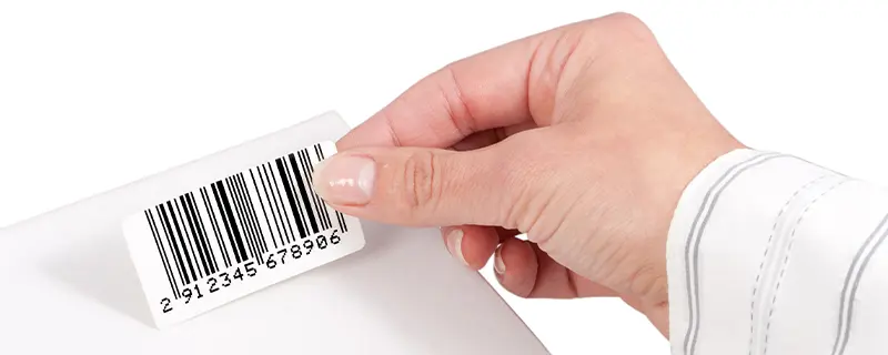
Acceptable Size Guidelines
To ensure legibility and impact, the logo must never be printed or displayed smaller than 0.5 inches tall. Maintaining this minimum size is essential for preserving its clarity and recognizability.
Proper Spacing
The logo should always be surrounded by clear space equivalent to the height of the "z" in "Wizard". This spacing prevents visual clutter and ensures the logo stands out in any application.
![]()
Examples of Correct and Incorrect Usage
Correct Usage:
The logo should always maintain its proportions, use the approved colors, and include the full brand name "Wizard Labels."
![]()
Incorrect Usage:
- Do not stretch or squish the logo.
- Do not change the colors or apply effects such as shadows or gradients.
- Do not isolate "Wizard" from "Labels" or modify the text.
![]()
When to Use Different Logo Versions
Full-Color Logo: Ideal for use on light or neutral backgrounds.
White Logo: Suitable for single-color printing or use on darker backgrounds where the full-color logo would lack visibility.
![]()
By following these guidelines, you help us maintain the integrity and professionalism of the Wizard Labels brand. Proper logo usage ensures that our trademark remains consistent, recognizable, and impactful across all applications. Thank you for your cooperation in supporting and protecting the Wizard Labels identity.
If you have any questions about these guidelines or need further assistance, feel free to Contact Us. We’re here to help!