
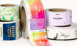


Your supplement label isn’t just a sticker—it’s your first impression, brand identity, and compliance proof all rolled into one. With a crowded market, your label needs to stand out, build trust, and meet regulatory requirements while still looking sleek on the shelf.
From choosing the right color scheme to designing a clear supplement facts panel, here’s how to create eye-catching and FDA-compliant dietary supplement labels that make customers stop and take notice.
1. Choose the Right Color Palette
Color isn’t just about aesthetics—it affects how your brand is perceived. A well-thought-out color scheme can help convey trust, energy, or wellness, depending on your product’s purpose.
- Green & earth tones → Popular for eco-friendly, organic, and natural supplements.
- Blues & whites → Often used for science-backed, clinical formulations.
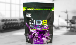
- Bold colors (reds, yellows, oranges) → Ideal for sports nutrition and high-energy supplements.
Your packaging design should dictate your color choices, but also consider contrast for readability. A vibrant background with hard-to-read text won’t help sales—it will hurt them.
2. Typography That Stands Out
Customers shouldn’t have to squint to read what’s in your supplement. Choosing clear, professional typography is key to making sure your product looks trustworthy and high-quality.
- Sans-serif fonts like Helvetica or Open Sans keep things clean and modern.
- Serif fonts give a classic, premium feel but should be used minimally.
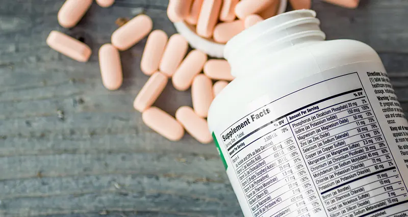
- Bold, easy-to-read typefaces work best for ingredient lists and supplement facts panels.
Make sure important product claims like "High Protein" or "Certified Organic" are prominent but don’t overpower the label. If a font is too decorative, it can make critical details hard to read—especially on a small supplements bottle with label space.
3. Balance Graphics and White Space
A cluttered label is overwhelming, while too much white space can feel empty. The goal is to balance text, images, and branding elements for a clean, well-structured design.
Best uses for effective supplement label design:
- Use icons for quick recognition of benefits (e.g., "Non-GMO," "Vegan-Friendly").
- Keep branding consistent by using one or two key fonts and a unified color scheme.
- Let white space breathe—it helps important details pop instead of getting lost.
If your label looks like it’s trying too hard to say everything at once, chances are customers will skip it. Simplicity sells.

4. Highlight Key Product Features
Your label should answer one big question: Why should customers choose your supplement?
Make sure you highlight what matters most, whether that’s:
- "Organic Ingredients" for health-conscious buyers
- "High Protein" or "Low Sugar" for fitness-focused consumers
- "Clinically Tested" for science-backed formulations
A well-placed callout box or bold statement helps these benefits stand out without overwhelming the design.
Your ingredient list should be easy to find and read. Customers (and the Food and Drug Administration) want transparency, so don’t bury key details in tiny print.
5. Optimizing for Print and Digital
A great design means nothing if it doesn’t print well or look good online.
Printing Considerations:
- Choose high-quality label materials—BOPP, matte, or gloss finishes impact durability.
- Work with an experienced label printing company that understands FDA-compliant regulations.
- Proof your label before final production—colors look different on-screen vs. in print.
Digital Optimization:
- Make sure your label is clear in online product listings—customers should be able to read details even in thumbnail images.
- Test mockups on different screen sizes to ensure everything remains visible before finalizing your design.
This balance between packaging design, label printing, and digital visibility ensures your product looks professional everywhere it’s displayed.