Durable, High-Quality Labels with a Metallic Finish
Metallic BOPP label paper is a water-resistant, oil-resistant, and long-lasting material designed to give product packaging a sleek, reflective metallic look. These labels provide a polished, high-end appearance while maintaining strong adhesion on plastic, glass, and metal surfaces.
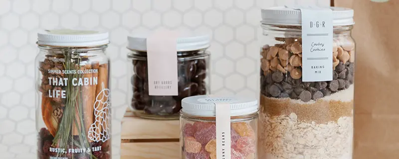
With a bright metallic sheen, metallic labels work well for cosmetics, food and beverage packaging, health products, promotional branding, and more. Whether you need labels for bottles, jars, pouches, or candle tins, metallic BOPP label paper offers both style and durability.
What Is Metallic BOPP Label Paper?
Metallic BOPP label paper is a durable, moisture-resistant material with a smooth, reflective surface. This material is widely used in high-end product labeling due to its strength, resistance to smudging, and ability to hold vibrant colors and crisp text.
Key Features
- Metallic finish creates a polished, professional look
- Water-resistant and oil-resistant, making it ideal for refrigerated or high-moisture environments
- Strong adhesive ensures secure, long-term application
- Available in multiple finishes for different branding styles
- Suitable for both hand and machine applications
How to Design Metallic BOPP Labels That Look Great
In the label industry, there are a lot of different terms for metallic BOPP label paper. Some call them chrome labels, silver labels, or metallic stickers—but they all refer to the same type of material.
To keep things simple, we refer to it as metallic BOPP label paper because it has a highly reflective, mirror-like finish, similar to chrome accents on a car. This material is made from Biaxially Oriented Polypropylene (BOPP), a durable plastic film with a metallic coating. It is resistant to water, oils, and everyday wear, making it ideal for cosmetic packaging, candles, food products, and beverages.
The Trick to Designing Metallic Labels
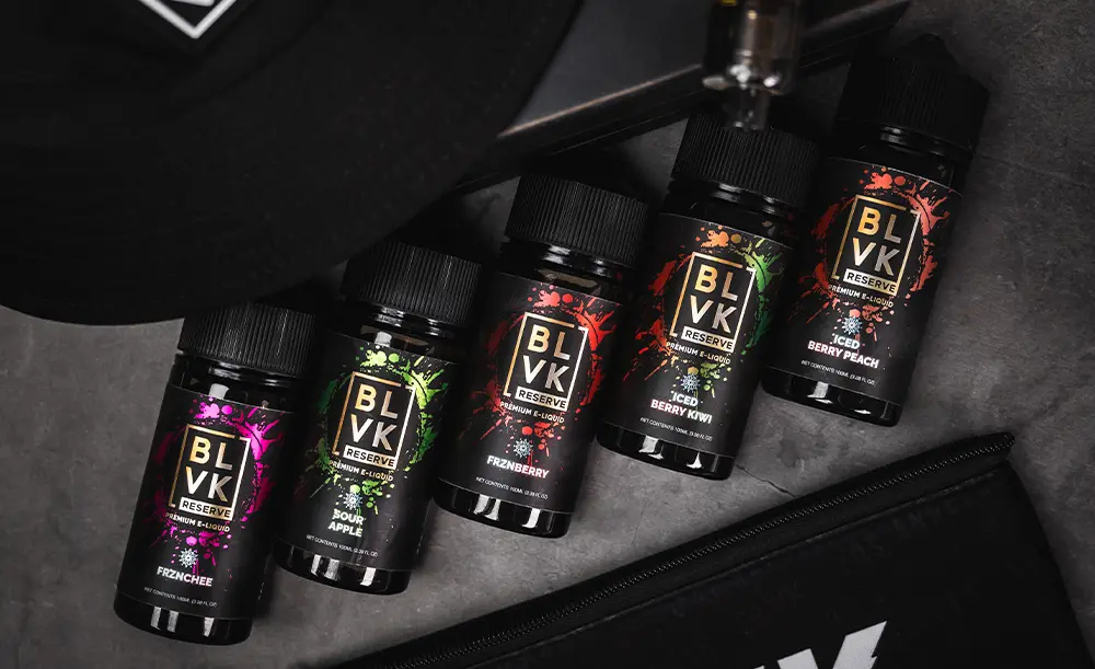
Metallic BOPP labels print differently than standard white labels. Because the material is reflective, colors appear semi-transparent, allowing the metallic finish to shine through.
For example:
- Yellow ink printed on metallic BOPP looks like gold.
- Light blue ink appears like a metallic silver-blue.
- Dark colors may not show the metallic effect as strongly.
This effect can create eye-catching designs, but it can also make text harder to read if not handled properly.
How White Ink Affects Your Design
To control how the colors appear, designers use a white ink layer underneath certain parts of the design.
- With a white layer: Colors print normally, as they would on a white label.
- Without a white layer: The metallic background shines through, changing how colors look.
For example, if you print yellow text without a white layer, it looks like metallic gold. But if you place a white layer behind it, the yellow prints solid and true to color. To learn more about using white ink for your Chrome BOPP labels, read our article, How to Indicate Where to Print White Ink on Your Product Label.
Tips for Printing on Metallic BOPP Label Paper
- Use less ink for metallic colors. The more ink you apply, the less metallic effect will show through. Light color builds work best.
- Build gold tones using magenta and yellow. A good mix is 20% magenta and 60% yellow.
- Expect colors to darken slightly. Since the metallic background affects how colors appear, printed colors may look slightly deeper than they do on screen.
- Use gradients and screens of white ink to create semi-metallic effects.
- A 10-20% white ink screen creates a soft, semi-transparent metallic look.
- A 45% or higher white ink screen appears almost solid, reducing the metallic effect.
Choosing the Right Material for Your Design
If you want a true metallic look, designing with selective white ink layers is the best approach. But if you want solid, predictable colors without worrying about transparency, printing on white BOPP instead may be a better choice. Both options provide high-quality, durable labels that make your products stand out.
Best Uses for Metallic Labels
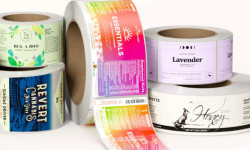
Metallic BOPP label paper is designed for both product branding and decorative applications. These labels are commonly used for:
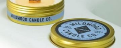
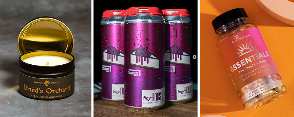
- Candle tins and candle lids: Provides a premium look with durable adhesion.
- Essential oil bottles: Withstands exposure to oils and moisture.
- Beverage bottles and food packaging: Works well for juice, wine, specialty foods, and refrigerated items.
- Cosmetic packaging: Adds a sleek, reflective surface for beauty and skincare products.
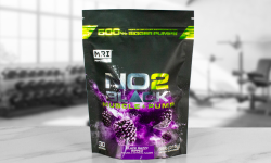
- Health and wellness products: Commonly used for vitamins, supplements, and personal care items.
- Promotional and branding: Used for marketing labels that need a metallic finish.
The moisture and oil resistance of metallic labels makes them a great fit for products exposed to handling, refrigeration, or damp environments.

Shapes and Sizes
Metallic labels are available in various shapes and sizes to fit different types of packaging.
- Rectangle labels: Common for bottles, boxes, and flat surfaces.
- Square labels: Ideal for branding, promotional stickers, and logos.
- Oval labels: Popular for cosmetic packaging, candles, and food jars.
- Circle labels: Often used for container lids, product seals, and minimalist branding.
- Custom-shaped labels: Designed for specialty packaging and unique branding.
For products with unconventional packaging, custom sizing ensures a precise fit.
Finish Options for Metallic BOPP Label Paper
Metallic labels are available in several finishes, each offering a different look and level of protection:
- Gloss laminate: Creates a reflective, high-shine effect.
- Matte laminate: Offers a smooth, soft finish with no glare.
- Soft touch laminate: Provides a velvet-like texture for a premium feel.
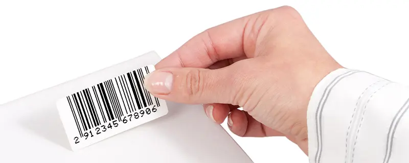
- Thermal transfer laminate (gloss or matte): Allows for variable printing, such as barcodes or batch numbers, while maintaining a polished look.
The right finish ensures the design stays crisp, colors remain bold, and labels hold up against wear and tear. Learn more about our finish options on our Label Finishes page.
Adhesive and Liner Options
Adhesives
The adhesive type determines how well the label stays on the product and how easily it can be removed:
- Permanent adhesive: Strong bond for long-term use. Ideal for bottles, jars, and durable packaging.
- Tight mandrel adhesive: Designed for curved or tight-radius surfaces, ensuring the label stays in place.
- Removable adhesive: Allows for easy repositioning without leaving residue.
Liner Options
The liner affects how labels are dispensed and applied:
- Clear PET liner: Strong and durable, great for machine applications.
- Paper liner: A more traditional option, ideal for hand applications.
Choosing the right combination of adhesive and liner ensures seamless application and long-term durability.

Durability and Adhesion
Metallic BOPP labels are designed to adhere securely to a variety of surfaces, including plastic, glass, and metal packaging. Their strong adhesive ensures they stay in place even when exposed to:
- Moisture and condensation (ideal for refrigerated products)
- Oils and lotions (great for cosmetics and beauty products)
- Frequent handling (suitable for consumer goods and promotional stickers)
These labels are tear-resistant, fade-resistant, and smudge-proof, making them a reliable choice for products that need to maintain a polished, professional appearance over time.
Why Choose Metallic BOPP Label Paper?
For brands looking to upgrade their product packaging, metallic labels provide both visual appeal and long-term durability. These labels:
- Give products a polished, professional look
- Hold up against moisture, oil, and frequent handling
- Adhere securely to plastic, glass, and metal surfaces
- Offer multiple finishing and adhesive options
Whether you're designing labels for cosmetics, food and beverages, health products, or promotional branding, metallic BOPP label paper is a versatile and reliable choice.
