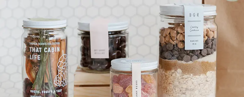


Key Elements of Effective Body Butter Labels
What Customers Look for in Body Butter Labels
When scanning the shelves, customers look for three key elements in body butter labels:
- Eye-catching Design: A stunning label design grabs attention. Whether it’s vibrant colors, unique patterns, or elegant simplicity, the visual appeal can make or break the first impression.
- Clear Information: Consumers today value transparency. They want to see ingredients, benefits, and usage instructions clearly listed. A label that communicates effectively can win trust and loyalty.
- Brand Story: A good label does more than inform—it connects. Your label is a prime opportunity to tell your brand’s story, why your body butter is unique, and what values you stand for. This emotional connection can be a powerful motivator for customers choosing which jar to take home.
Choosing the Right Materials and Adhesives
Selecting the appropriate materials for your body butter labels is crucial, especially since the product contains oils that can deteriorate ordinary labels. Here’s a deeper dive into your options:
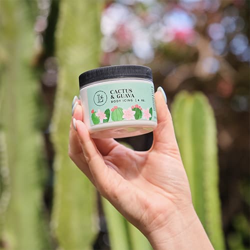
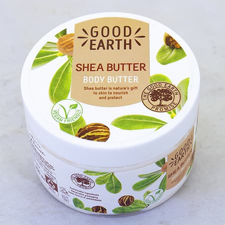
- Ultra Clear BOPP Plastic: This material is virtually invisible, providing a no-label look that allows customers to see the product as if the container were bare. Ideal for showcasing the natural color and texture of your body butter, it helps emphasize the purity and quality of the contents.
- White BOPP Plastic: Known for its durability and strong resistance to water and oils, white BOPP is a reliable option that serves as a perfect backdrop for any design. Its bright white color enhances the vibrancy of printed colors, making your label pop on store shelves.
Adhesives Play a Big Role
- Permanent Adhesives: These create a strong bond that is crucial for containers that will be handled frequently in potentially oily or moist environments, such as bathrooms. An example is the acrylic-based adhesive, which is known for its excellent clarity and aging characteristics, ensuring that labels maintain their look and adherence over time.
Protection Against Water and Oils
It’s not just about sticking; it’s about staying pristine. Body butter labels face a greasy challenge, often getting smeared or smudged. Here’s how to combat that. Both options not only enhance the aesthetic of your labels but also provide an extra layer of protection against the elements:
- Matte Finishes: Offer a soft, sophisticated look and are less likely to show fingerprints, keeping your labels looking clean.
- Glossy Finishes: Create a vibrant, eye-catching sheen that can resist moisture and stand out on the shelf.
Learn more about various finishes on our Label Finishes page.
Making Your Labels for Body Butter Jars Stand Out
Here are a few tips to ensure your body butter labels catch the eye and the imagination:
Use Bold Typography
Make your brand name impossible to miss and easy to read at a glance.
Incorporate Unique Graphics
Whether it’s a whimsical illustration or a minimalist design, unique graphics can convey your brand’s personality instantly.
Be Consistent
Ensure that your label design is consistent with your brand’s overall look and feel. This creates a cohesive brand experience that customers will recognize and remember.
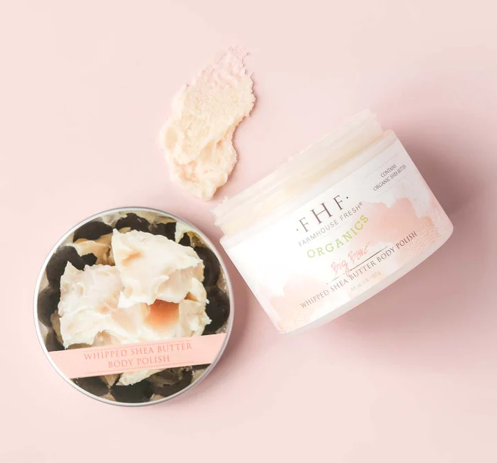
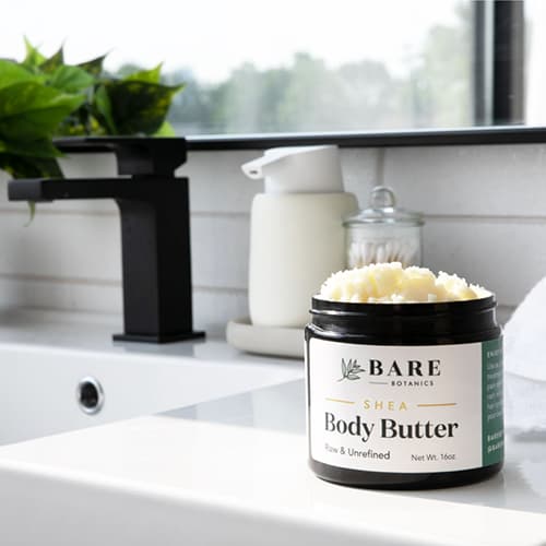
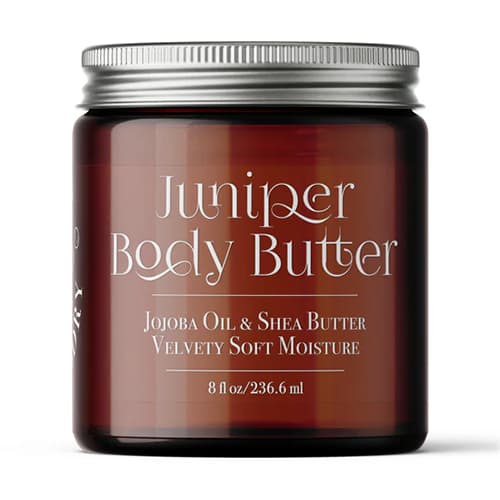
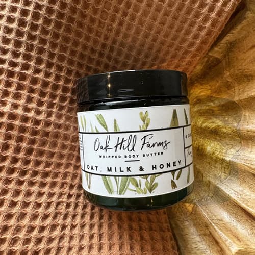
Body Butter Labels Design Ideas
Wrap-Up
Choosing the right label for your body butter is a blend of art and science—design that dazzles and materials that last. Remember, a great label not only reflects what’s inside the jar but also who’s behind the brand. Ready to label up and stand out? Check out our extensive range of options tailored for body butter and other lotion products.
By ensuring your labels are as resilient as they are beautiful, you'll give your body butter the best chance to thrive in a competitive market. Don't just make your product—make a statement.