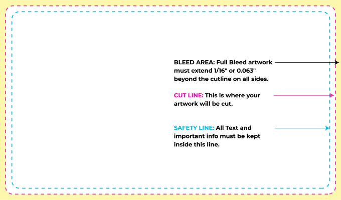
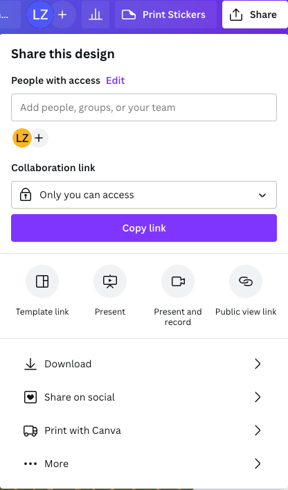
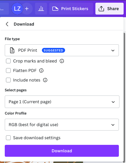
Your label's journey from digital file to printed masterpiece is not always straightforward. Follow the guidelines below for the easiest, fastest, and most cost-effective production of your product labels. If you need help with the label design itself, check out our Graphic Design Services. Whether you need to refresh your current label design, or start a design from the beginning stages, our team of professional graphic designers can help. Take a look at our Frequently Asked Questions page for additional help with creating your custom labels.
Also please note that once your artwork files have successfully made it through the proofing process, any subsequent revisions will require us to repeat that process for any replacement files - and will incur revision charges for each file that we have to re-work. So it's critically important that you check your artwork for accuracy before submitting them to us.
Our primary preferred file type is .AI (Adobe Illustrator native format). **Note - due to software compatability issues with some of the most recent releases of Creative Cloud, please back-save all Illustrator files to CC2018 format before sending them to us. We expect this issue to be corrected by the software vendors shortly.
We also accept .PDF, .PSD (Photoshop native), and EPS. If you need help arriving at the correct format, contact us and we'll try to assist. We can often work with other file formats too, but feel free to send us a sample file in advance to save time when you order.
Note – if using Photoshop to design your labels, please read the Special Note under the Resolution section on this page, which explains the challenges associated with textual content built in Photoshop.
For best results, all files should be designed and submitted in CMYK mode (not RGB) – otherwise automatic conversion will occur when we send the files to press and significant color shifts can occur. To learn more about the differences between CMYK and RGB, check out our blog post: RGB vs. CMYK - What??
If you intend to use White ink in your design (for example on Clear or Chrome labels), check out this FAQ about white ink.
All Fonts should be outlined (or flattened) – please do not send live fonts with your files. To learn more, check out our blog post: How to Outline Fonts When Sending Label Artwork.
Each individual label design should be in its own file and named clearly to indicate which label it applies to, e.g. Body Lotion 8oz Vanilla.eps – or similar convention that clearly differentiates between designs.
Any artwork files named in a way that makes it impossible for us to identify their contents individually (e.g. "label1.pdf" or "jenny3.ai") or some convoluted convention that means nothing to anybody but the designer (e.g. lynns_outlined_300_latest_for_print.pdf") may be rejected and you'll need to rename and resubmit the files - which of course introduces unnecessary delays. It's quite simple - please have your designer use sensible file names that reflect the contents so we can easily identify individual versions.
Bleeds should be included (1/16" or 0.063"on all sides) where appropriate. A bleed is where the background design or color carries beyond the edge of the label, a critical component to allow for minor shifts during the cutting process. To learn more, check out our blog post: Product Label Design Artwork Bleeds.
Clear Space of at least 1/16" should be allowed inside the finished size – no significant elements (type, images etc) should encroach into this space, except for background colors/patterns which should be extended to provide the "bleed" mentioned above. To learn more, check out our blog post: Remember Clear Space When Creating Labels.
All artwork should be created using Imperial measurements (i.e. inches) and dimensions rounded to the nearest 1/32" (0.031") - with the exception of Special shapes. Please read our Blog post about Label Artwork Sizing for further explanation.
For best results, files should be created at 300 DPI resolution. Note - higher resolutions than 300 DPI do not produce better printed results, but lower resolutions can be disappointing when printed.
Special note: it's important to understand that Photoshop is designed for editing photos, not text. While it can be used for textual content, the printed output can be questionable due to the way Photoshop treats fonts (known as "rasterizing") which can pixelate the content noticeably. Conversely, Illustrator works in "vector" format and preserves the sharpness and quality of the fonts regardless of how much zooming is done. So, for commercial print purposes, whenever textual content is involved (like labels) Illustrator will almost always achieve a better result. It is certainly possible to use Photoshop for some elements of the design, but the results should be imported into Illustrator if possible - which is the best platform for overall design tasks.
Please make sure all placed graphics and images are embedded and not included as a linked image.
Note - Embedded images should also be sized at 300 DPI (at intended image size when printed) – anything higher has no effect on the finished result and should be avoided to keep files to a manageable size. To learn more, check out our blog post: Embedding Linked Graphics in Your Product Label Artwork.
Please check all artwork for spelling or typing mistakes – we do NOT proofread artwork.