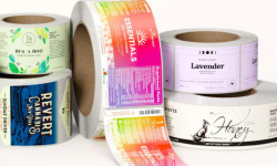


In today’s competitive market, product packaging can make or break a sale. More and more brands are choosing clear labels to create sleek, modern packaging that lets their products shine. Whether it’s for beverages, cosmetics, or food, transparent labels offer a minimalist look that highlights the product inside.
But how do you know if clear labels for printing are the right choice for your product? Let’s take a closer look at the pros and cons of print clear labels, and how you can use them to stand out on the shelf.
What are Clear Labels and How to Use Them
What Are Clear Labels?
Clear labels are just what they sound like. They are printed on a transparent material, usually clear plastic film. This is different from opaque materials like white paper or vinyl.
This transparency allows the product itself to be visible through the label, creating a “no-label” effect. Brands use this approach to create a simple design. This design allows the product to be the main focus. It also provides space for important branding and information.
When you print clear labels, you allow the natural color or texture of the product to shine through, giving it a unique look. This type of labeling is especially popular in industries where the appearance of the product is a key selling point.
Benefits of Using Clear Labels
Clear labels aren’t just a trend—they offer several benefits that can make your product more appealing to customers. Let’s break down some of the key reasons brands choose to use clear labels for printing.
- Sleek and Modern Look
If you want your product to have a clean, minimalist design, clear labels are the perfect choice. Because they don’t dominate the packaging, they create a sleek and modern aesthetic. This is great for brands aiming for a simple, sophisticated look.
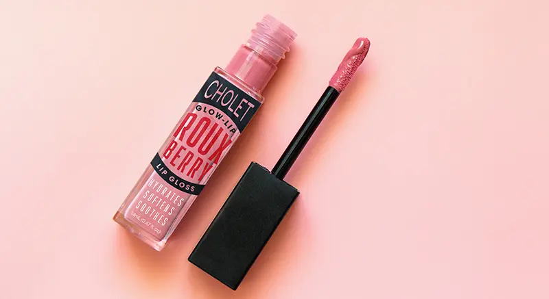
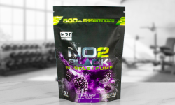
Products like bottled water, craft beers, and skincare serums can benefit from this design approach, where the label doesn’t overshadow the product. - Show Off the Product
One of the main reasons brands choose transparent labels is to showcase the product itself. For example, a cold-pressed juice or artisan honey with a beautiful natural color can be a big selling point.
With a clear label, the product becomes part of the visual experience, helping to draw customers in. If the product inside your packaging looks as good as it tastes or works, why hide it? - Versatile Across Industries
Clear labels for printing are versatile and can be used for a wide range of products. They work particularly well for:

-
- Beverages: Letting customers see the liquid inside makes drinks more tempting. Whether it’s bottled water, juice, or even wine, transparent labels let the drink’s color become part of the branding.
-
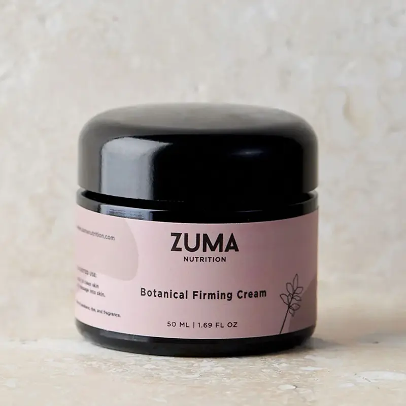
- Cosmetics: Beauty products like lotions, oils, and serums often use clear labels to emphasize cleanliness and purity. The simple design of a clear label suggests high quality and luxury.
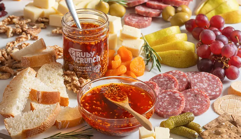
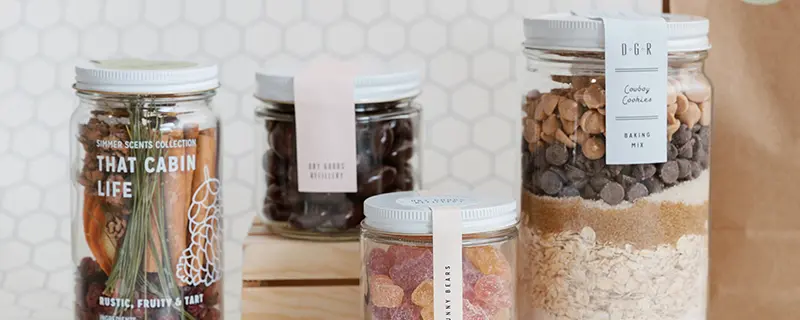
- Food Jars: For honey, jams, sauces, and other food products, clear labels let the rich textures and colors of the food itself do the talking.
Clear BOPP vs. White BOPP or Paper: What’s the Difference?
![]()
Challenges of Printing Clear Labels
Clear labels have many benefits, but they also have some challenges. You should think about these before deciding if they are right for your product.
- Product Color Can Affect Design
When you print clear labels, the product’s color or texture may influence how your label looks.
Because the label is transparent, the color of the product will show through any areas without printed ink. This can be a great effect if planned correctly, but it can also create issues if the product color interferes with the text or design.For instance, light-colored text or images might become hard to read if placed on a dark-colored product. To avoid this, you can use a white ink layer behind certain design elements. This blocks the product color from showing through and ensures your text stays readable and clear.
- Air Bubbles During Application
Another challenge with transparent labels is that they can trap air bubbles during application. These bubbles are more noticeable with clear labels than with opaque ones because the air pockets can be seen through the material.While professional application methods can minimize bubbles, it’s important to test the application process on your product to ensure a smooth result.
How to Use Clear Labels Effectively
Now that you understand the benefits and challenges, let’s talk about how to get the most out of clear labels for printing.
1. Keep the Design Simple
The beauty of transparent labels lies in their simplicity. Instead of using heavy design elements or large blocks of color, focus on minimalistic logos and text. Since the product itself becomes part of the design, you don’t need to overwhelm the label with too much detail. Less is more.
2. Test Your Labels Before Committing
It’s always a good idea to test your clear labels on the actual product before ordering in bulk. Since the product color or texture can influence the final look, testing will help you make sure the design looks as expected once applied.
You’ll also want to check how the labels handle during application—especially if your product has a curved or uneven surface.
3. Use High-Quality Materials
Not all clear labels are created equal. Choose materials that are strong and resist moisture. This is important if your product will be kept in humid places, like a bathroom or refrigerator. High-quality clear labels will maintain their appearance over time and help your product look professional and polished.
Best Products for Clear Labels
Some products are naturally better suited to transparent labels than others. Let’s look at a few types of products where clear labels really stand out:
-
- Cold-Pressed Juices and Beverages
Juices, smoothies, and even alcohols like craft beer or wine look fantastic with clear labels. The natural color of the drink can become part of the design, adding to the overall appeal.
- Cold-Pressed Juices and Beverages
-
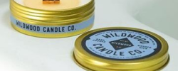
- Skincare and Beauty Products
Clear bottles of serums, oils, and lotions often use clear labels to give the product a clean, upscale look. The simplicity of the label suggests purity and quality, which is perfect for beauty products.
- Skincare and Beauty Products
- Food Items
Jars of honey, jams, or sauces often benefit from transparent labels. Customers love seeing the product inside, and the clear label gives them a preview of what they’re getting without hiding the contents.
Final Thoughts on Clear Labels
Clear labels offer a stylish, modern way to showcase your product. Whether you’re looking to highlight the natural beauty of your food, drink, or skincare item, transparent labels can create a unique and appealing presentation.
However, it’s important to consider the potential challenges, like how the product color might affect the label design or the risk of air bubbles during application.
When done right, clear labels for printing can make your product stand out on the shelf and communicate a high-end, professional image. Ready to create custom clear labels for your product? Contact Us at Wizard Labels, and we’ll help you design labels that let your product speak for itself.
FAQs: Clear Labels for Products
What are clear labels, and how do they differ from regular labels?
Clear labels are printed on transparent materials like clear plastic film, unlike regular labels, which are typically printed on opaque paper or vinyl.
Clear labels allow the product’s packaging or contents to be visible through the label, creating a sleek, “no-label” look. This design approach works well for brands that want a minimalist, modern feel for their packaging.
What types of products are best suited for clear labels?
Clear labels work best for products where the appearance of the item inside is a key selling point. Popular choices include:
- Beverages like juices, bottled water, and craft beers, where the drink’s color can be part of the branding.
- Skincare and beauty products, including lotions and oils, where a simple, clean look is ideal.
- Food items like honey, jams, and sauces that have rich textures or colors that attract customers.
Are clear labels durable enough for refrigerated products?
Yes! High-quality clear labels for printing are made to withstand moisture and temperature changes, making them an excellent choice for products stored in refrigerators or damp environments. Whether you’re labeling cold-pressed juices or bath products, clear labels can hold up under these conditions if you choose durable materials.
How do you prevent air bubbles when applying clear labels?
Air bubbles can sometimes form under transparent labels during application, especially on curved or uneven surfaces.
To minimize this, ensure that the surface of your product is smooth and clean before applying the label. Working with professional applicators or testing the label on a small batch of products can also help reduce the chance of bubbles.
Can I print white or light-colored designs on clear labels?
Yes, but keep in mind that the color of the product may show through lighter-colored inks. To avoid this, you can add a white ink layer behind the lighter elements in your design. This will block the product’s color from altering the label’s appearance and make sure your design stands out clearly.